Think of it as color harmony for your entire house, not just one good room.
Painting room by room is fine. Painting with a whole-home palette is better. A cohesive color plan helps your spaces flow naturally from room to room, makes your home feel calmer and more pulled together.
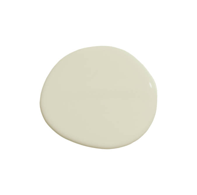
This palette is all about warmth without heaviness. Creamy, soft neutrals keep things light and inviting, while deeper accents add just enough contrast to ground the space.
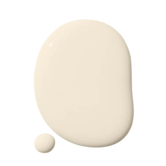
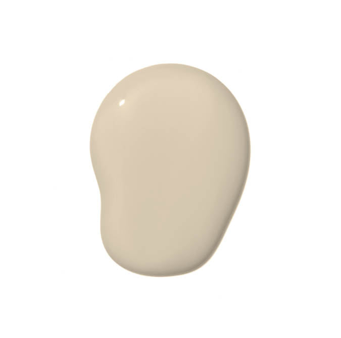
Like Buttah
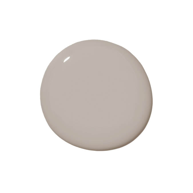
Neutral Territory
Timeless
Flatiron
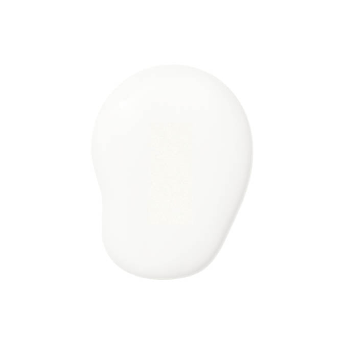
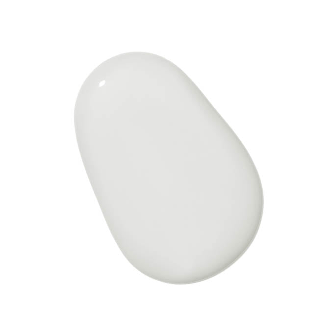
Whipped
Turbinado
Like Buttah
Neutral Territory
Flatiron
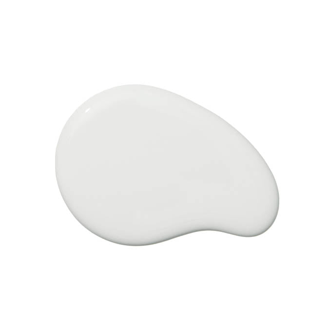
Whipped
Why it works: Warm undertones connect rooms seamlessly, even when light changes throughout the day.
This mix balances airy neutrals with richer, moodier shades for definition. Lighter colors keep common spaces open and bright, while deeper tones add structure to bedrooms, offices or dining rooms.
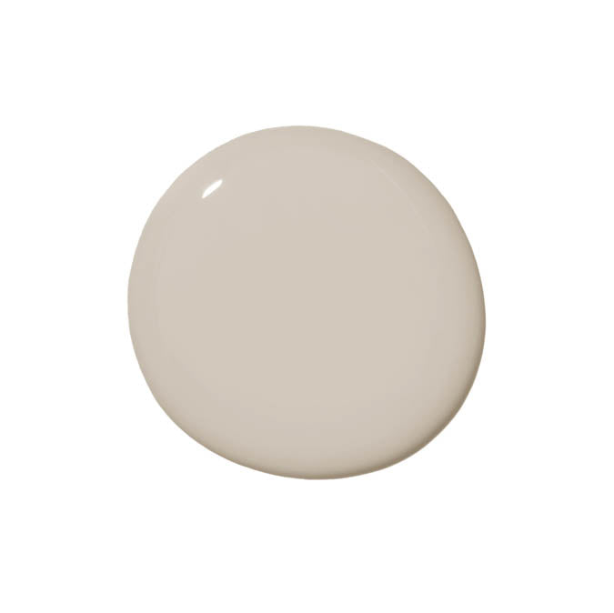
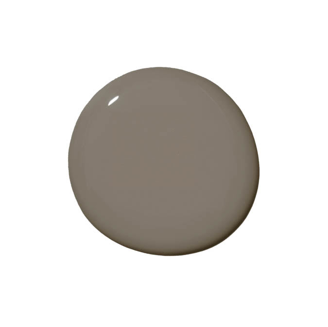
Greige
Make Waves
Penthouse
Rain Check
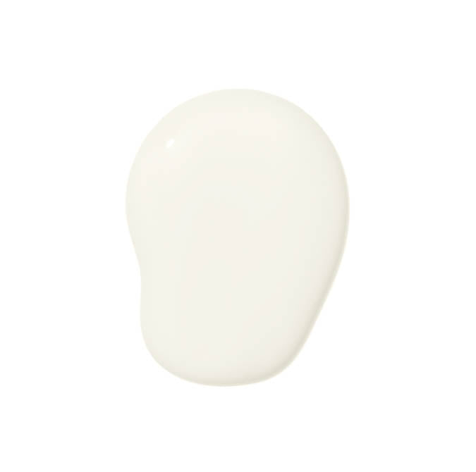
Classic
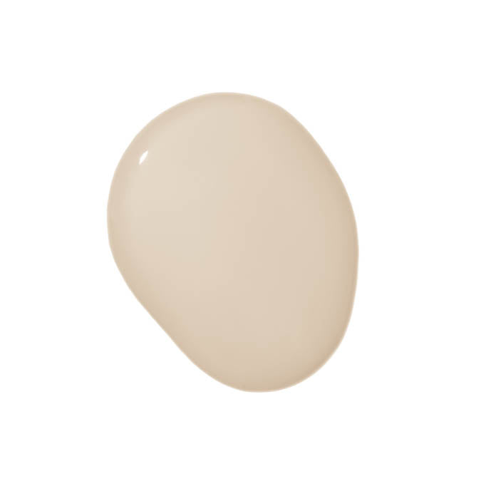
Dirty Chai
Greige
Make Waves
Rain Check
Classic
Why it works: Contrast gives each room purpose while still feeling part of the same story.
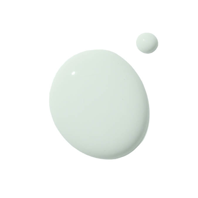
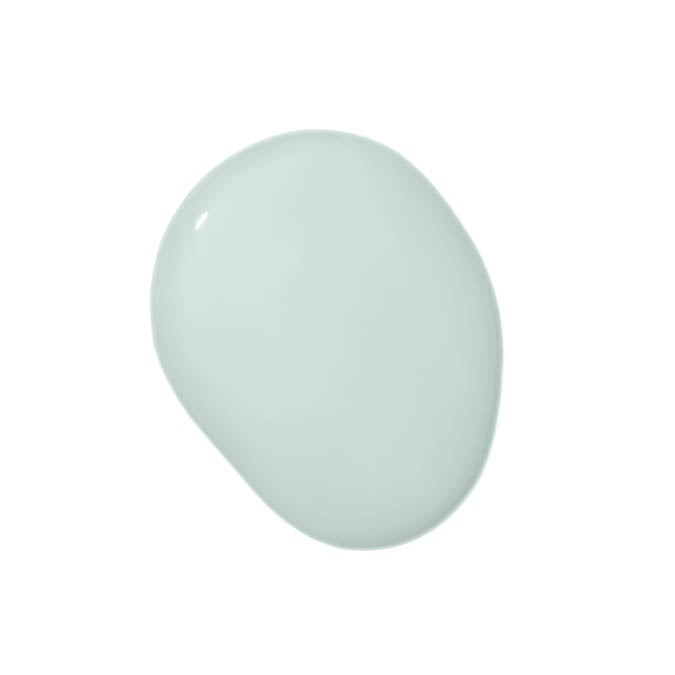
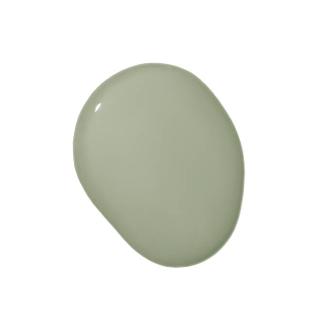
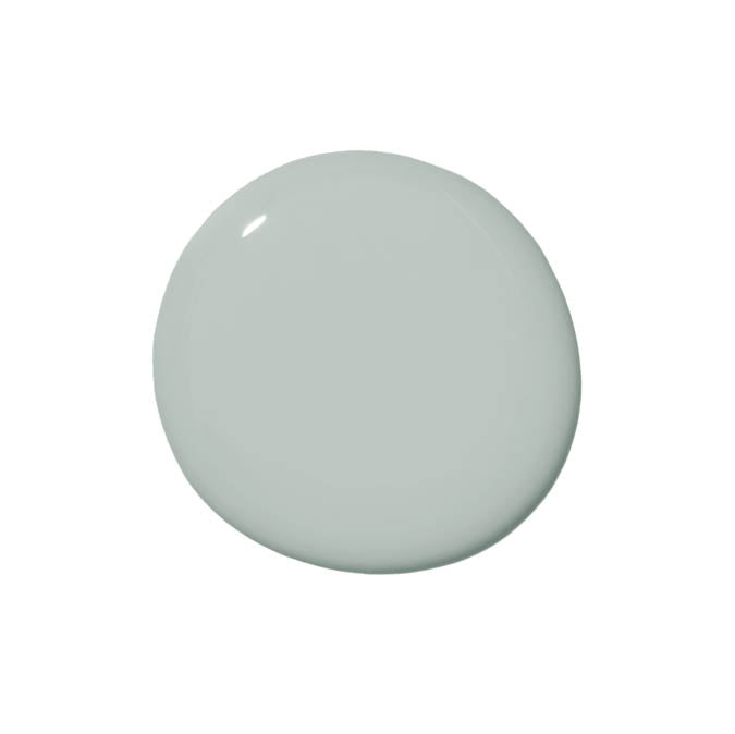
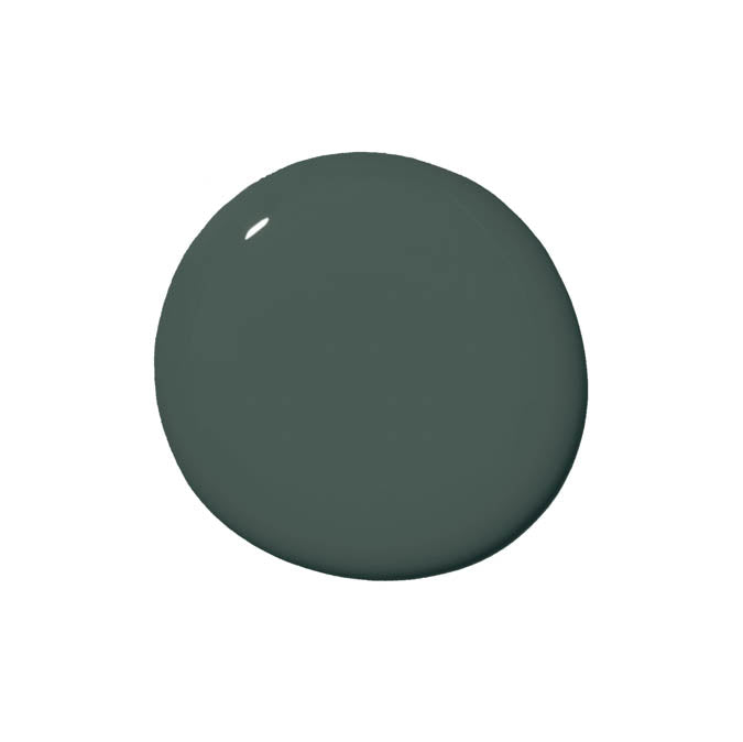
Inspired by the outdoors, this palette leans calm, cool and restorative. Soft greens and grounded neutrals create a peaceful flow that feels especially good in bedrooms, bathrooms and anywhere you want to exhale.
Flow State
Headspace
Money Moves
Grayish
Current Mood
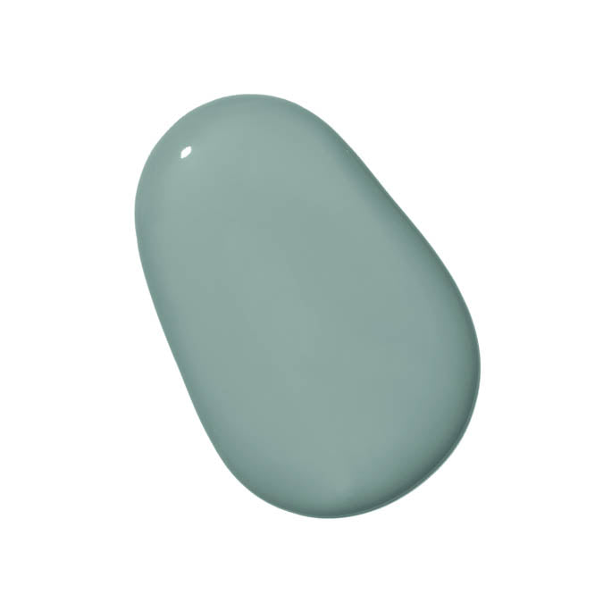
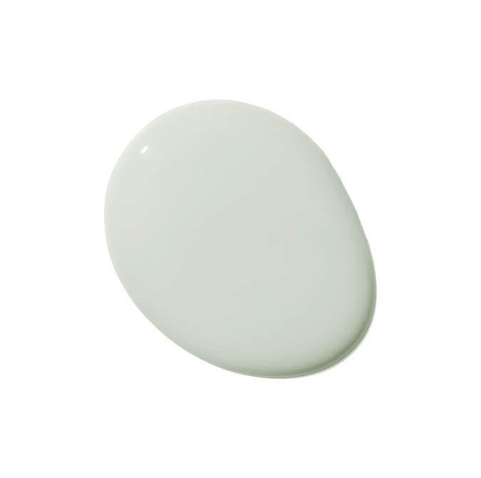
Greenish
Flow State
Money Moves
Greenish
Grayish
Why it works: Natural hues are easy on the eyes and even easier to live with, room after room.
Our curated Swatch Kits let you see multiple shades together, in your actual space, before committing. Because planning ahead is always easier than repainting later.
This is an email sent by Clare. All copyrights and
trademarks remain the property of their respective owners. Email
Inspire is not affiliated with Clare.
Other Emails from Clare
Meet your blush crushes 💌
The easiest kitchen refresh for 2026 🍽️
Spring is almost here—give your walls a head start 🌱
Look up! Your next glow-up is above your head
One weekend. One room. Total transformation.
Nordic neutrals for your softest winter era
Paint tricks designers swear by 👀
Designer-Approved Color Pairings (That Always Work)