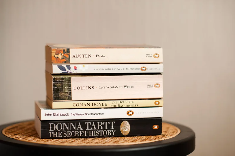
Typography has always been at the heart of Penguin’s brand, from its minimalist early paperbacks to its bold mid-century modernism and beyond. In this deep dive, Emily Gosling and Monotype’s Charles Nix reflect on Penguin’s design evolution, starting with Jan Tschichold’s revolutionary tri-band system.
The discussion spans Penguin’s use of Gill Sans, its transition to Helvetica, and its postmodern experimentation. The brand does all this while maintaining clarity, structure, and care for the reader. As Penguin continues to adapt to the digital era, its legacy reminds us that great typography isn’t just about style, it’s about shaping how ideas are received, remembered, and understood.
Read full story