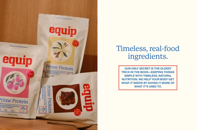
Equip’s rebrand positions itself as a refreshing opposition to the loud, performance-driven visual language of modern wellness brands. Drawing on “natural nostalgia,” Wedge crafted an identity inspired by vintage pantry aesthetics, warm color palettes, and thoughtful typography to evoke authenticity and longevity. Strawberry milkshakes, anyone? This system emphasizes clarity over complexity, aligning with the brand’s promise of simple, whole-food nutrition.
While some illustrative elements may feel less resolved, the rebrand succeeds in differentiating Equip within a crowded category. It proves that restraint, heritage callbacks, and thoughtful design systems are effective at communicating trust and purpose more effectively than trend-driven, hyper-polished branding.
Read full story