|
‘Neutral’ is a tricky concept because it requires a reference point—a color (or idea) to be neutral towards. Skin tone is the body’s personal neutral. Out of doors, a sandy tan could be the neutral for desert, and green for jungles or forests. Black is the neutral of New York; stripes the neutral of Paris; leopard the neutral of people who don’t believe in neutrals.
|
|
Theoretically, any color could be a neutral with the right framework.
|
|
|
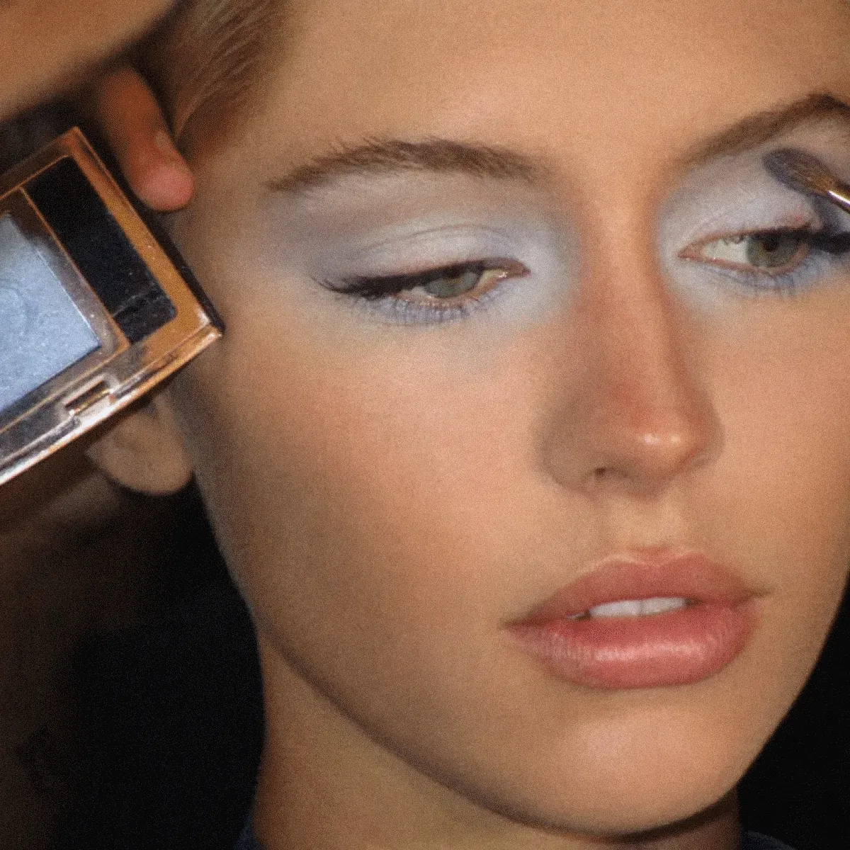
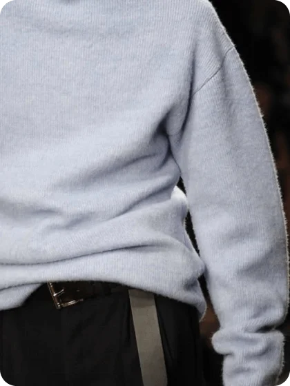
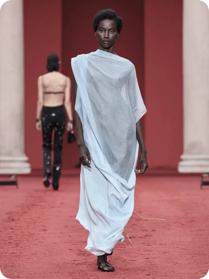
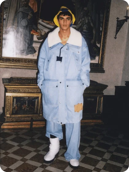
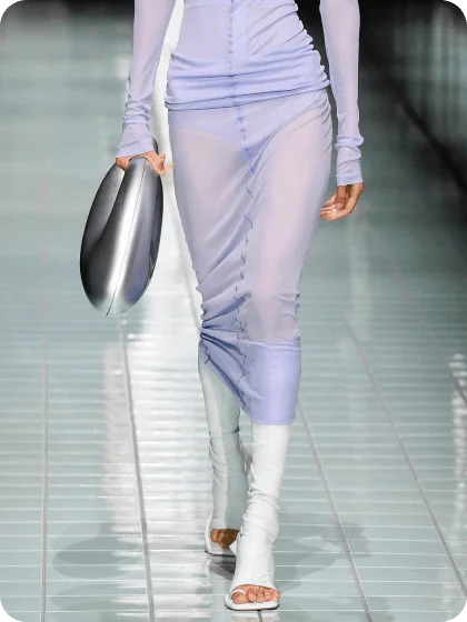
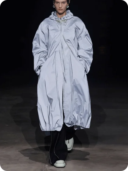
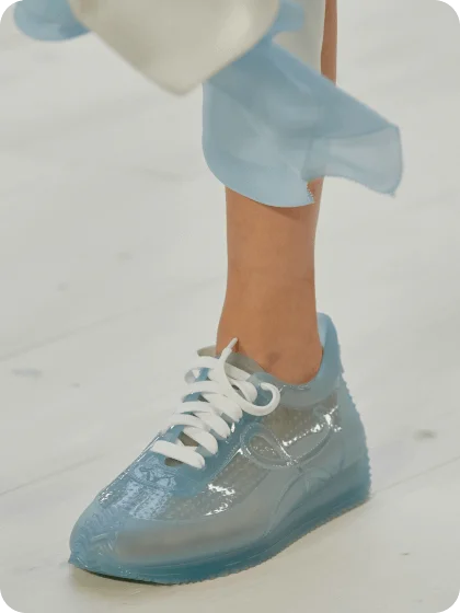
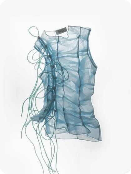
Take a milky, soft powder blue...
|
|
It’s a neutral of mood, an interior baseline, and fashion’s favorite non-beige foundation.
|
|
|
|
|
|
|
|
|
|
|
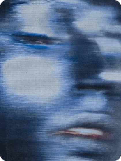
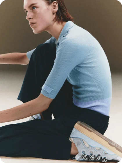
The tone itself is an overlapping Venn diagram between cloud and sky.
|
|
|
Not aloof, but lofty; dreamy yet clear.
|
|
|
|
It contains multitudes because, like the ocean, it appears blue partially because it reflects the sky.
|
|
|
|
|
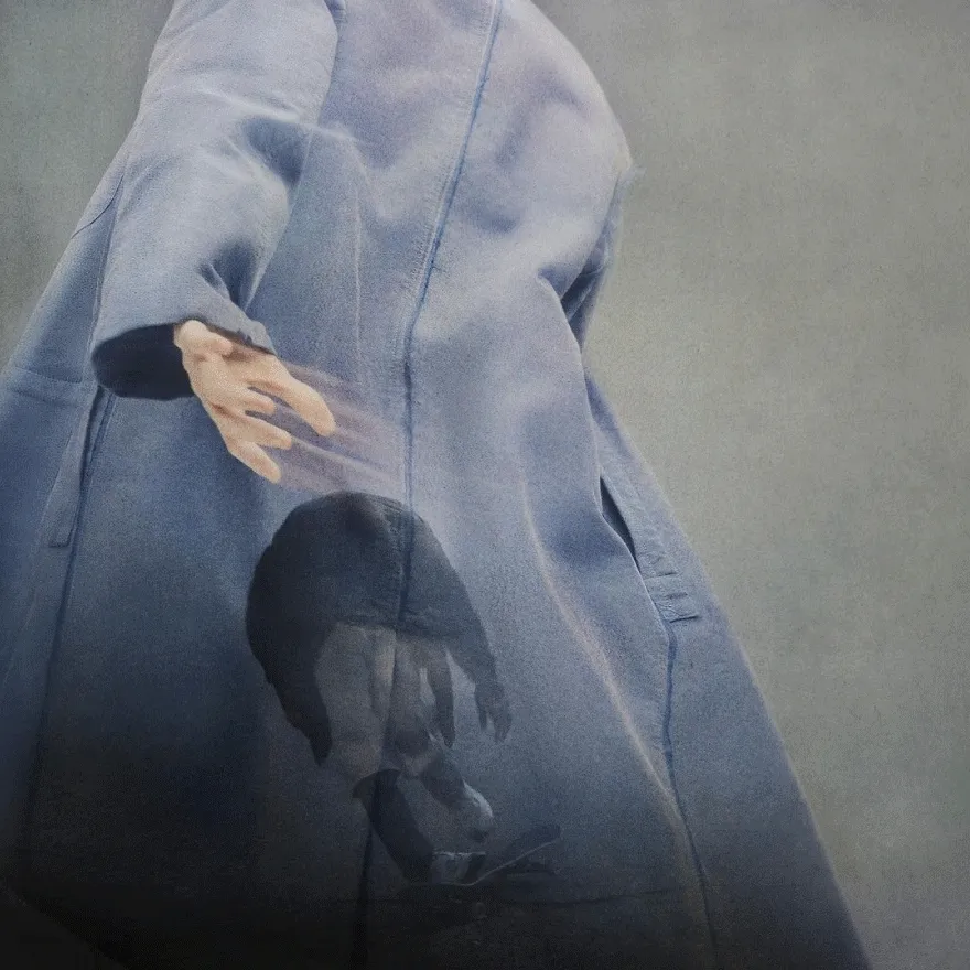
Water is not intrinsically blue, and blue is in the cornea of the beholder, from a light-wave perspective.
|
|
|
|
|
|
You only see the blue your eye (and mood) allows you to see.
|
|
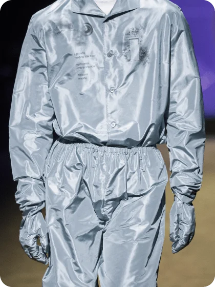
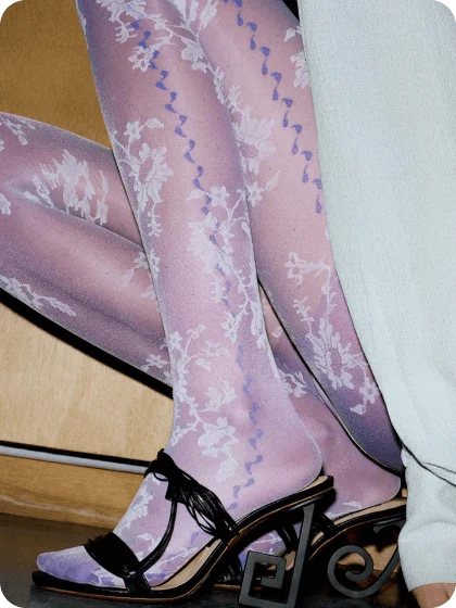
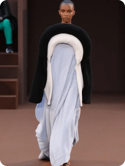
Fashion gets periodically obsessed with the shade for its demure demeanor and elusive relativity.
|
|
|
|
|
|
|
|
|
It can be cool and detached (if you are), soft and vulnerable (if you are), minimalist and citified or naively rustic.
|
|
|
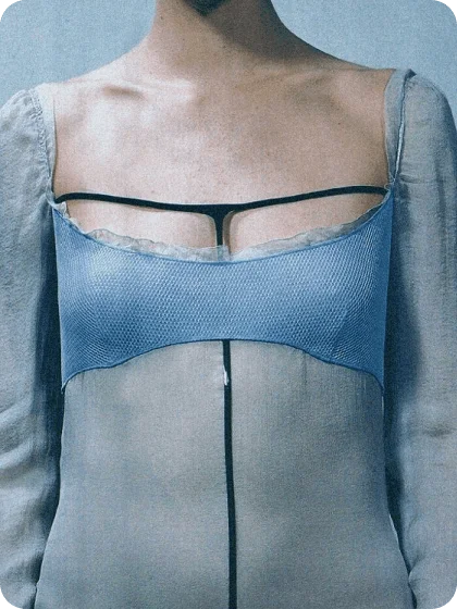
That’s why Xtra Milk’s aura is this precise shade—the universal musk is the neutral of skin-scents, and yet everyone smells something a bit different in it.
|
|
|